Table of Contents
ToggleEver found yourself staring at a blue sky and wondering what could possibly be its colorful counterpart? Well, if you’ve ever tried to paint a room or pick an outfit, you know that understanding color relationships can be a game-changer. It’s not just about aesthetics; it’s about making bold choices that make heads turn and jaws drop.
Understanding Color Theory
Color relationships play a crucial role in design and aesthetics. Understanding these relationships helps in making impactful choices.
Primary Colors
Primary colors consist of red, yellow, and blue. These colors serve as the foundation for all other colors. Artists and designers utilize primary colors to create a range of hues. They cannot be formed by mixing other colors. Each primary color evokes different emotions; red signifies passion, yellow represents cheerfulness, and blue conveys calmness.
Secondary Colors
Secondary colors stem from mixing equal parts of two primary colors. Orange, green, and purple emerge through this process. Orange results from mixing red and yellow, green combines blue and yellow, and purple forms from red and blue. These colors enrich palettes and expand creative options. They can enhance designs, creating vibrant and visually appealing compositions. Understanding secondary colors aids in refining color choices and achieving desired aesthetics.
What Color Is Opposite of Blue?

Orange represents the color opposite of blue on the traditional color wheel, showcasing a vivid contrast. Understanding this relationship aids in color selection for various applications, such as design and art.
The Color Wheel
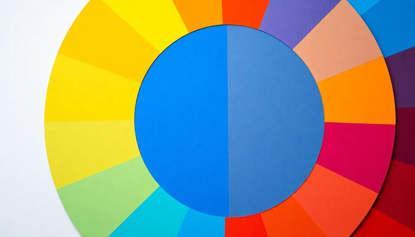
The color wheel consists of primary, secondary, and tertiary colors. Arranging colors in this circular format reveals relationships between hues. Each primary color combines with another to create secondary colors, expanding the palette available for creative expression. Blue, a primary color, sits opposite orange, highlighting the direct visual conflict. This arrangement assists designers in choosing harmonious combinations or sharp contrasts.
Complementary Colors
Complementary colors occur when two colors are directly opposite each other on the color wheel. These combinations create striking visual effects. Using blue alongside its complementary color, orange, generates vibrant energy. Designers often employ this technique to create bold statements in artwork or interior spaces. The synergy between blue and orange can evoke specific feelings, thereby enhancing the overall impact. Recognizing these relationships simplifies the color selection process, leading to effective design choices.
Real-World Examples
Understanding color relationships helps visualize their applications. The contrast between blue and orange appears in various domains.
Design and Art
Artists frequently use the blue-orange combination to create dynamic compositions. For instance, a blue background can enhance the vibrancy of orange elements, making them pop. Designers often implement this contrast in branding and advertising for its attention-grabbing qualities. Interior spaces benefit from this pairing; a blue wall with orange accents provides energy and warmth. Photographers also leverage this relationship, capturing vibrant landscapes during the golden hour when blue skies meet orange sunsets.
Nature and Landscapes
Nature illustrates the blue-orange dynamic in striking ways. Sunsets showcase brilliant orange hues against deep blue skies. Ocean scenes often present blue waters with sandy orange shores, highlighting the beauty of contrast. Additionally, flowers like orange marigolds thrive in lush green environments complemented by blue skies. These combinations create stunning visual experiences, inviting admiration. The vibrant contrast in natural landscapes serves as an inspiration for artists and designers alike, making them explore similar pairings in their work.
Implications in Various Fields
Understanding the relationship between blue and orange extends to numerous fields, influencing decisions in areas such as psychology and marketing.
Psychology of Color
Color psychology plays a vital role in emotional response. Blue often conveys tranquility and stability. In contrast, orange evokes energy and enthusiasm. Designers exploit this relationship to impact mood and behavior effectively. For instance, environments with blue tones can promote calmness, while spaces featuring orange can stimulate conversation and creativity. Businesses often consider these differences when crafting their atmospheres, ensuring they align with desired emotional responses.
Marketing and Branding
Brands utilize the blue and orange contrast for compelling marketing strategies. Associated with trust, blue appeals to consumers seeking reliability. On the other hand, orange can grab attention and inspire action. This contrast proves effective in advertisements, where the combination enhances visibility and memorability. For example, many fast-food chains adopt orange to create excitement while maintaining a sense of trust with blue branding. Understanding this color relationship helps companies craft strong visual identities, ultimately boosting engagement and sales.
Understanding the relationship between blue and its opposite color orange opens up a world of creative possibilities. This dynamic contrast not only enhances design aesthetics but also influences emotional responses. By leveraging the blue-orange pairing, designers and artists can create striking visuals that captivate and engage audiences.
Whether in fashion, interior design, or marketing, this complementary color scheme serves as a powerful tool for making impactful statements. The interplay of tranquility and energy embodied by blue and orange can transform spaces and experiences, making them memorable and effective. Embracing these color relationships ultimately leads to more thoughtful and intentional design choices.


